wiley global brand system
Client
Wiley
Year
2021
Role
Creative Director

The 200-year-old publisher Wiley rebranded in 2020 with a new mission: “unlocking human potential,” signaling a bold shift toward science, education, and human progress.
As Creative Director, I led the entire rebrand—developing the visual identity, brand personality, and architecture from the ground up. I partnered closely with the CMO and Brand Director to define our new strategy, then translated that into a visual system that positioned Wiley as bold, approachable, optimistic, and forward-thinking.
My role spanned strategy to execution:
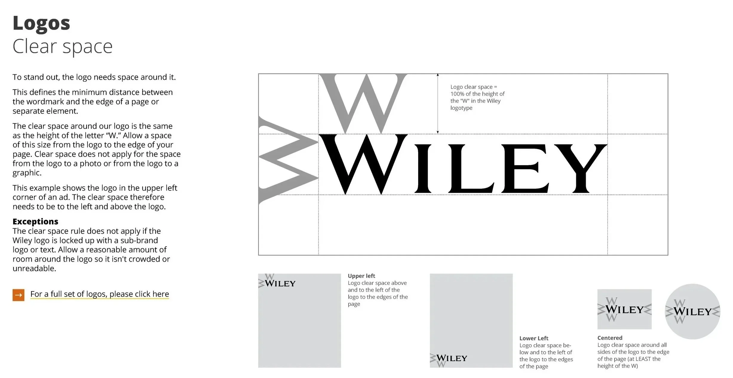
Developed the full visual identity system—from concept to rollout, and crafted the global Brand Guidelines
Crafted the brand personality and architecture in collaboration with leadership
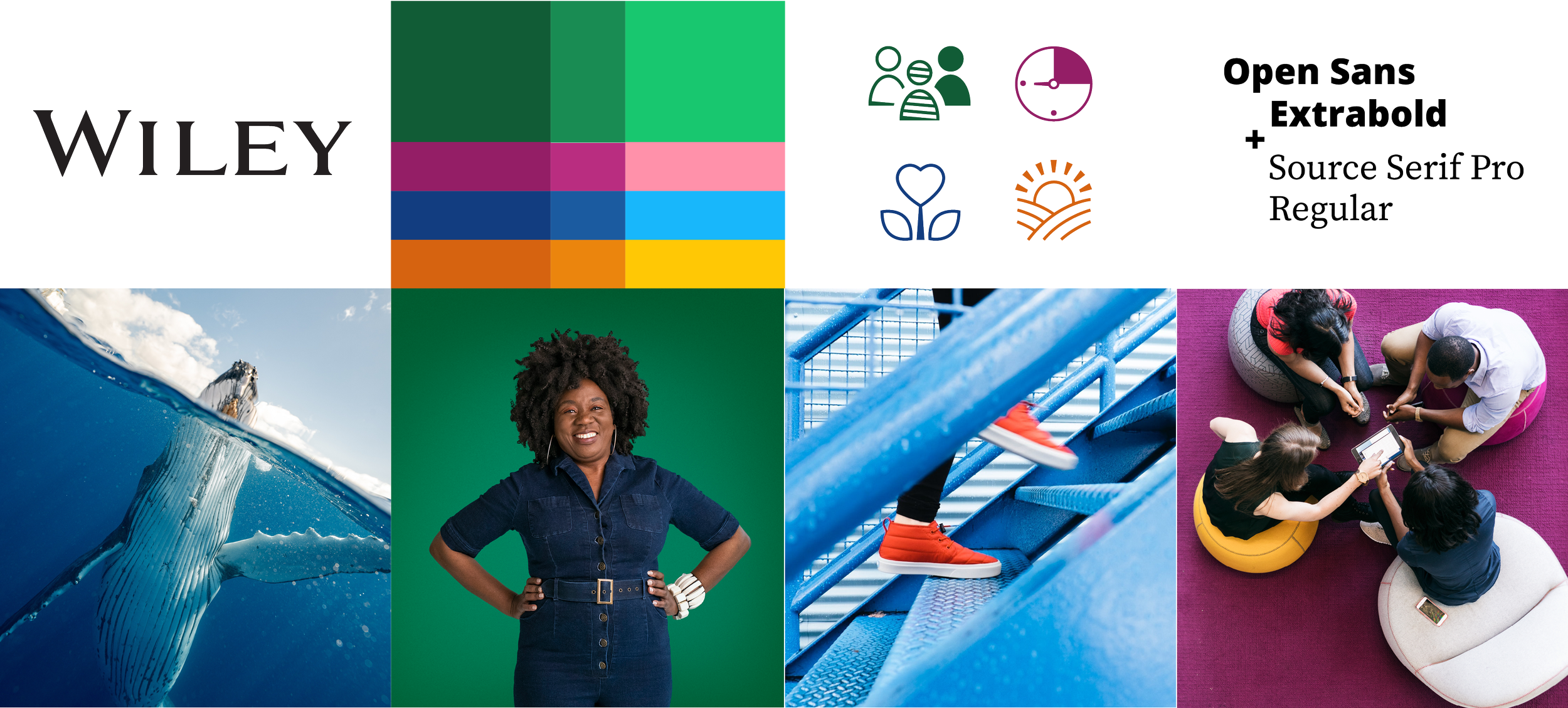
Elevated the wordmark for stronger presence across marketing and product
Designed a modern, scalable type system
Built a bold color palette—refined from 30+ to 4 signature colors
Created a custom photography library featuring real people in real environments
Designed bespoke iconography and brand symbols
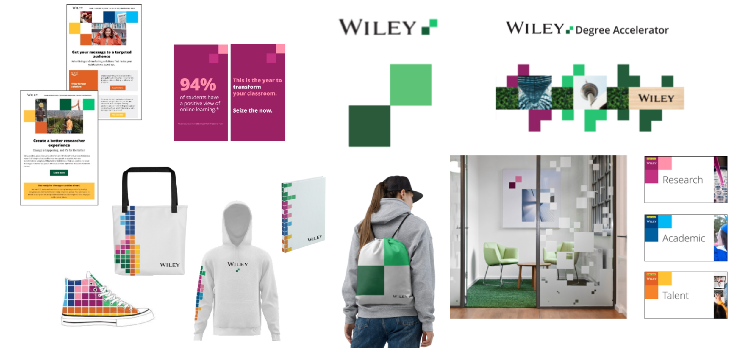
Introduced the “building blocks” motif now used across Wiley-led products and global activations
Developed simplified templates and toolkits for non-design teams
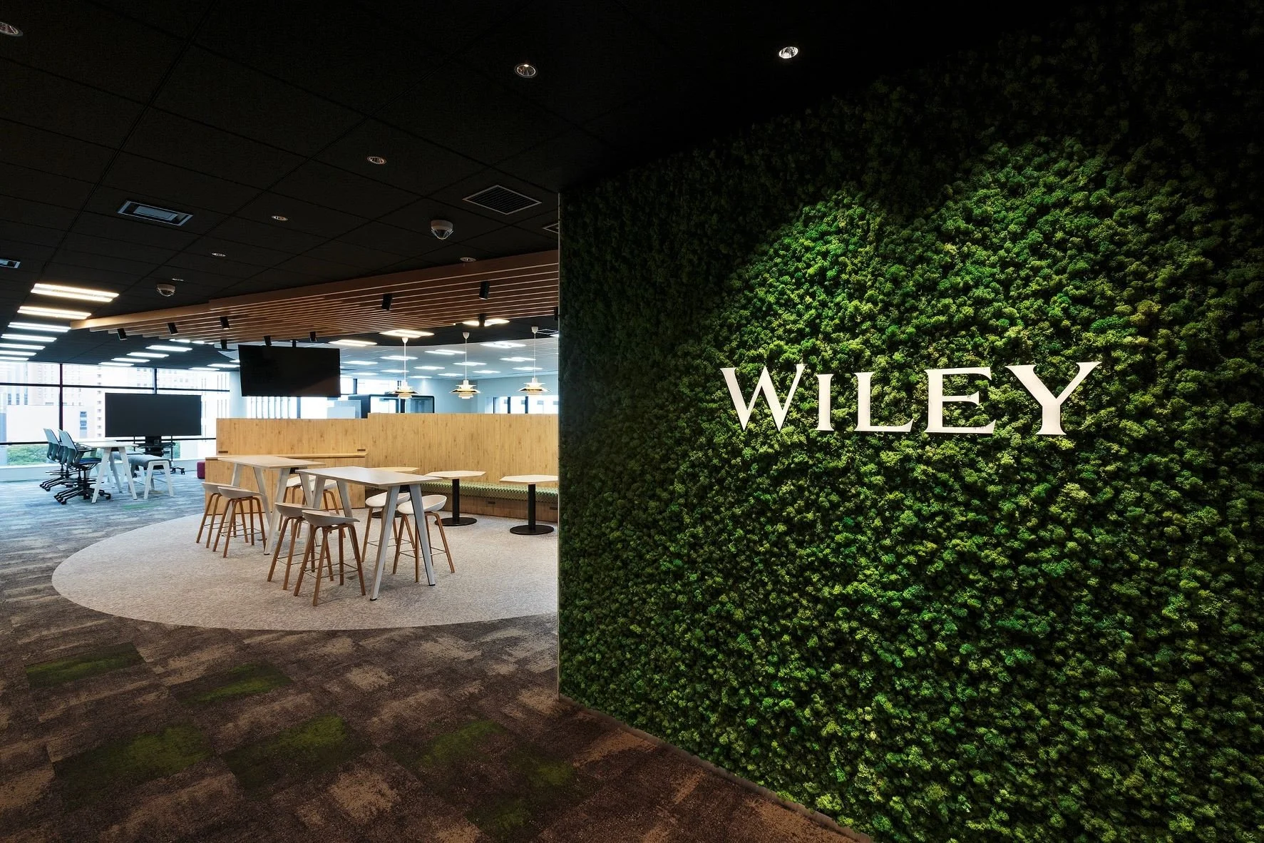
After launch, I activated the brand across digital campaigns, brand films, corporate events, a full website redesign, and the rebranding of offices worldwide. The first brand campaign exceeded planned impressions by 3x, with website traffic up 94% and pageviews up 52% compared to the previous year.
This wasn’t just a rebrand—it was a full-scale repositioning of a $2 billion global brand.


custom portrait photography
(agency: lonely leap)

custom environmental photography (agency: lonely leap)

event Booth design: frankfurt book fair

office design: berlin


email templates

